.gif)
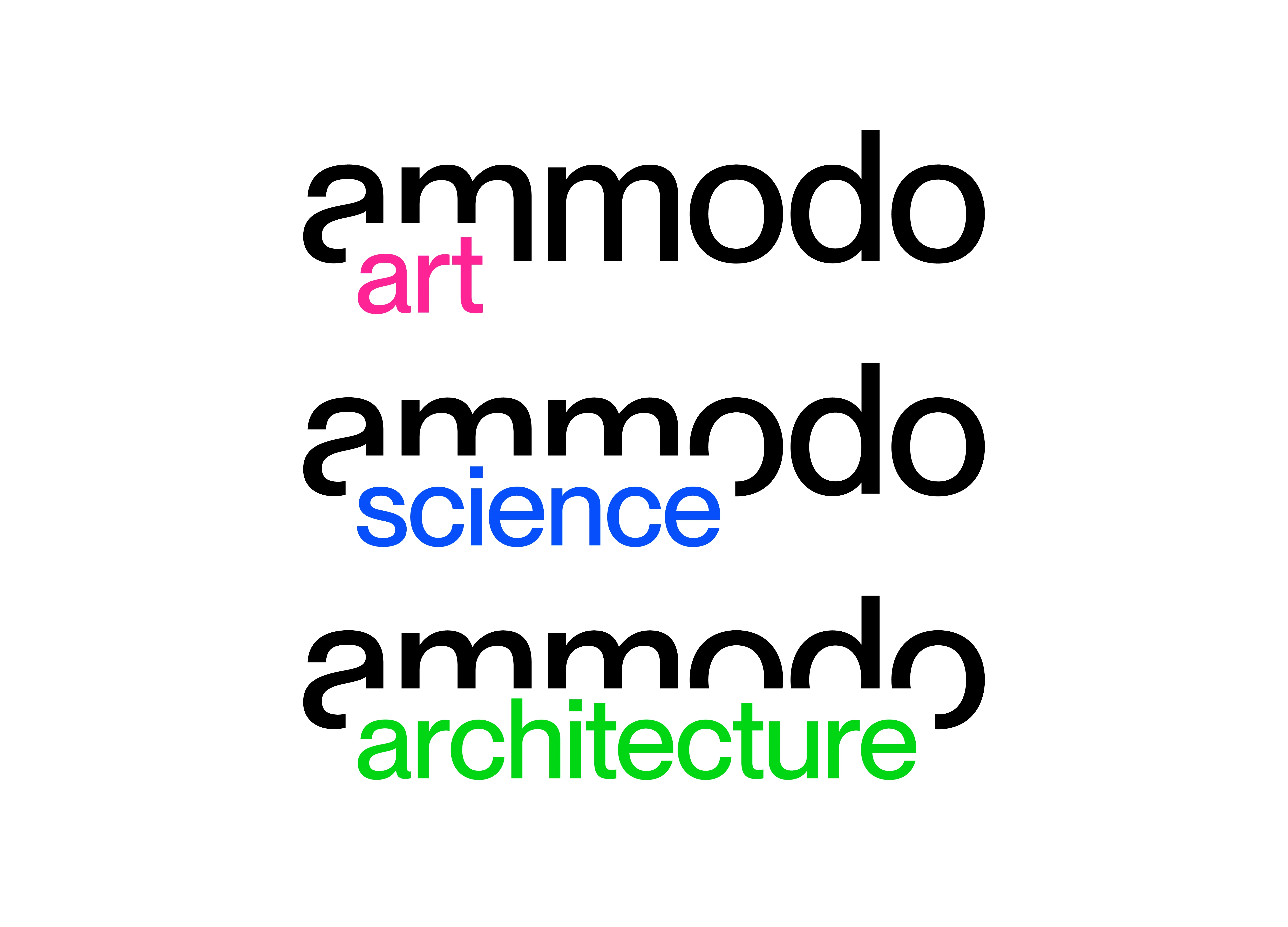
This new strategy was conceived to highlight that Ammodo fosters three separate programmes which each have their own content, policies and communities – but are still part of the same system.
In the words of Thonik: ‘The new graphic identity is based on an Ammodo wordmark that literally gives space to each of the subcategories. Cradled in the word “Ammodo”, the words “art”, “science” and “architecture” form part of the different logos.’
Read more about Thonik’s vision for the ammodo brand.
This transformation has resulted in a clearer reflection our work and values. Check out our new look and explore the expanded content on our updated platforms on ammodo.org, ammodo-art.org, ammodo-science.org and ammodo-architecture.org.
Published on 3 April 2025.


